


Jacen Burrows: Be Vocal About The Things You Love

Some time ago, I interviewed Jacen Burrows, who has only gotten better and stronger since! With the collapse of most of the print-side of the Comics Cube, I thought you all might like to read that interview, so am presenting it here.
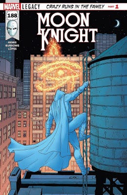
Burrows is currently drawing Get Fury for Marvel Comics, with writer, Garth Ennis.

Providence, Crossed, Moon Knight… Jacen Burrows has been turning out nothing but high quality work for years. Known for drawing brutality, from the action-adventure to horror varieties, he can also just draw the hell out of a room. There is an intentionality to his art that many of his contemporaries often lack, and a commitment to communication, whereby he can draw almost anything and have it register as plausible.
Jacen Burrows: Be Vocal About The Things You Love
(Reprinted from the Comics Cube, courtesy of Duy Tano)
by Travis Hedge Coke
Travis Hedge Coke: Recently, I saw your work praised as “cerebral,” and realized I think of you as a very physical, sensorial artist. What are your main goals with your art?
Jacen Burrows: One of the things that was drilled into me when I was still in Art School was clarity. You want anyone to be able to follow the action on the page, even without the dialog and narration, even people who are largely unfamiliar with comics. So, for me, that means clear, clean lines, consistent backgrounds with realistic perspective, and recognizable "acting" for the characters. I really want it to be possible for anyone from child to grandmother to be able to understand the flow of the narrative. Not that they are necessarily the audience in mind for most of my work!
But stylistically, abstraction has always been difficult for me to pull off and even though I admire a lot of artists who excel at throwing off the binds or rigid perspective and anatomy to add layers of expression to their art. So I tend to stick to my own version of "realism". I feel like if I can deliver a solid, tangible reality, then when things get weird and that reality bends, it feels more intentional and I hope it sells those moments better. Providence, for instance, is a rigidly grounded and clinical approach until it starts to get surreal and I hoped that juxtaposition would enhance the creep factor and moments of revelation.
Hedge Coke: What excites you most about the comics you agree to work on?
Burrows: Every issue always has a couple of big money-shot scenes, be it a big fight, a splash image of some important environment, or a character reveal. Those are always the most fun because you spend previous pages building toward those moments. Most of the work I have done hasn't been super actiony so I have actually been really enjoying trying to hone my own approach to action scenes. With Moon Knight, I really wanted to have a sense of brutality and consequence in the fights. I feel like it is important to depict violence in an uncomfortable, realistic way in order for it to have an impact. I want readers to think, ouch, I bet that hurts! I always had trouble getting into the major super-powered characters that can move buildings and fly into suns and stuff is because the action isn't relatable, it is just like a cartoon. The physical action of a character like Superman, for example, is no more relatable to me than a Roadrunner cartoon. To each their own, but I prefer street level characters for that reason. Although, I'd welcome the challenge of trying to figure out my own approach to that kind of action. I also get excited about set dressing the environments when I get interesting places to draw. It has always been one of the more fun aspects of the job for me. I love a good, interesting looking background scene or establishing shot.
Hedge Coke: Do you have a way that you could make a character like Superman (at least visually) interesting for yourself? Could you bring what’s of value to you into the overpowered superheroes?
Burrows: I think I'd try to change the focus from the close up actions of the characters to the effects of their actions. Tiny figures surrounded by massive destruction or POV shots of regular people witnessing the surreal events. Most of the time, it seems like the action is depicted with dynamic close in shots of power poses and gritted teeth, which is very comicbooky and fun, but I feel like it is pretty predictable. I'd just play with shifting the perspectives to try to give things a different energy. It would be fun to try some different things, visually.
Hedge Coke: What comics do you currently enjoy? (New releases, old stuff, just current for you personally.)
Burrows: I'm reading a lot of Marvel stuff these days to stay current with what the company is doing and I enjoy a lot of the books. The Immonen Spider-man stuff is mindblowing. He could draw piles of rocks for 20 pages and I'd still be floored. So good. All of the Waid/Samnee collaborations are a masterclass in pop comics. Dr Strange and Iron Fist have both been favorites of mine lately. I've been buying a lot of Image titles. Sex Criminals, Paper Girls, the Old Guard, Extremity, Head Lopper...they just have a ton of really fun books. And I loved Jupiter's Legacy. Millar and Quitely do amazing work together. Hell, Quitely could make anything good. There's an Image book called Isola that is, for me, probably the prettiest thing on the stands right now. And one of my all time favorite artists, Enrico Marini, just did a couple of Batman books for DC that were a joy to read. A lot of great stuff out there right now.
Hedge Coke: How do you plan a comics page? As a whole page, around one panel/image?
Burrows: Everyone I've worked with has always written in full script so a lot of that is already thought out as part of the storytelling. A panel with a lot of dialogue or an establishing shot is going to need more space. Talking head panels generally take up much less space. The pages just sort of instinctually Tetris themselves together through following the logic of the script. Sometimes I shift stuff around based on a compositional preference. Like, instead of a small square panel for a talking head shot that would make logical sense, I'll go with a long narrow horizontal panel to create a visual break line or to steer the eye a specific way. But it is all kind of a gut feeling thing.
Hedge Coke: Do you work out figures or backgrounds first?
Burrows: In the thumbnail stage, you really have to work out both simultaneously in order to figure out your page flow and storytelling. Sometimes the backgrounds are every bit as important as the figures and you need to know your perspective points to draw the figures at the right angles while also figuring out where you expect the word balloons to go. Once I'm drawing the real page, I tend to think foreground-to-background and build it depthwise.
Hedge Coke: Have you ever refused to draw something, specifically?
Burrows: No never. If a writer puts something in the script, I'll put it on the page. They asked for it for a reason and I have total trust in the writer's vision. And I'm completely comfortable with any content. The purpose of the content is really going to be the writer's responsibility at the end of the day and I want to tell their story how they envision it. Even if I found something personally offensive, I would assume the writer is doing it to explore important topics. It helps that I work with really great writers. I might be a little more apprehensive if I was working with writers I didn't trust implicitly.
Hedge Coke: What do you add into a comic that is not scripted?
Burrows: If you think about it in movie terms, the comic artist has to be the art director, the director of photography, the costume and set designer, the casting director, the location scout, etc. If it isn't the plot and dialogue, the artist has to figure it out. Even a writer who takes a more active role in the visual direction is still only able to point in the general direction. For every issue I draw, I download hundreds of photos of all sorts of stuff, in order to bring it to life. For example, if a story has a scene in Redhook, Brooklyn, I might go on Google street view and do screen shots of buildings so I can make it feel like real Redhook. The more references, the more real a story feels. But I don't like to copy the references exactly. A traced photo reference feels exactly like what it is and it often takes me out of the story when I'm reading comics so I just lift details and apply them to my own compositions.
Hedge Coke: What do you think audiences most often misinterpret about your artwork?
Burrows: That's a tough one. I guess when it comes to the more extreme stuff like Crossed, I worry that some audiences, particularly the ones who judge without reading it, will assume it was nothing but degenerate shock value. Being extreme just to be extreme. But I'm quite proud of the Crossed stuff I drew for Garth Ennis, particularly volume one. People remember the hardcore moments, but it was actually a pretty slow burn series about loss, humanity in the face of tragedy and the costs of survival. Splatter horror has real depth for those who seek it...while also throwing in some humor and ridiculousness. The series certainly became more shock oriented as it went on but I stand by the stories I drew.
Hedge Coke: What has been the hardest thing, in your professional career, for you to draw the way you wanted it? To get just right?
Burrows: Probably heads and faces, honestly. I've always been ok at the features but getting them the right size and the right place to make the faces look accurate can be a challenge. I feel like a lot of the wonkiness of my early work comes from trying to decide if I want to be cartoony or realistic. Your personal look is something you just get better at as you do more pages, naturally, but you always question, is this a stylistic flourish or a mistake? Aside from that, the biggest hurdle is time. You always need to be pushing forward and finishing pages. That's the nature of the business. But there are times you really wish you could take all the time you need to really do the best work you are capable of. Unfortunately, if I did that I would probably end up taking a week to draw every page and I'd go bankrupt, the company would lose money on the title or it would just never come out. And I suspect, you'd lose some of the immediacy and excitement of the medium. Things might end up feeling stale if they're too meticulous and precious.
Hedge Coke: If you could go back and teach yourself one or two techniques, when you were first starting as a professional artist, what would they be?
Burrows: I've always worked in a sort of European influenced clean line style, in part because I wasn't great at applying black and rendering shadows and stuff. Now I use high contrast stuff sometimes for effect and I wish I had spent more time developing that early on. Similarly, I always struggled with whether or not I wanted to try to add mid tones through hatching or feathering or whatever. The clean line style can end up feeling a little empty or flat without mid tones and spotted blacks and I always wished I'd worked out a way I was comfortable with to do more of that. As an example, you see a lot of beautiful, complex middle tones in the works of Art Adams and Moebius while still essentially being the clean line style. But I don't want to lose what I feel works with my style either. Art is an ever evolving process, though. Who knows what my stuff will look like in a few years!
Hedge Coke: Do you have any advice for the comics-reading community?
Burrows: Be vocal about the things you love. If a book really speaks to you, talk about it, spread the word. Also, and this can apply to everything these days but specifically with comics; Don't take the internet too seriously. There are some lousy, toxic people out there, but if you actually go out to conventions and local comic shops and meet real comic fans you find a rich community of passionate, inclusive people who love the medium making up the vast majority of fandom. And make it a point to share your books with friends who don't necessarily read comics already. We can always use a few new faces!


